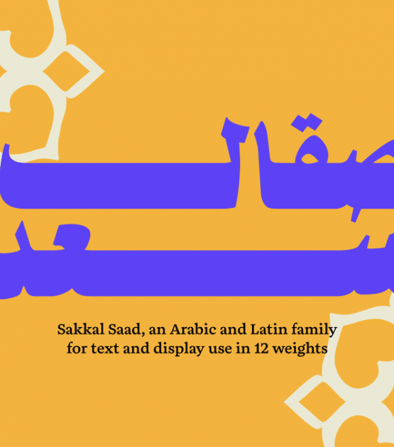
Bold, playful, and chunky display family, rich in features and in its ability to be used widely
Designed by Dr. Mamoun Sakkal and Aida Sakkal, the Sakkal Saad font family is a friendly, handwritten Naskh with both a modern feel and a nostalgic vibe. Inspired by the energetic and expressive typography of Middle Eastern newspapers, magazines, and posters from the 1960s–1980s, it captures the vibrancy and optimism of that era while adding a contemporary twist.
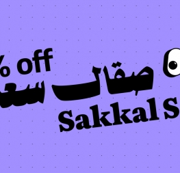
Sakkal Saad and Sakkal Saad Poster combine for 12 total weights, providing a versatile design system. The two families share harmonised metrics and a rich set of OpenType features, which allows designers to move easily between text and display within the same project. The compact vertical proportions allow for space economy while maintaining legibility. In Sakkal Saad Poster, the heavier weights increase in contrast along the baseline stroke to take up more vertical space with a commanding presence that still only barely extends words horizontally across a line.
Each style in the Sakkal Saad family contain over 3,000 glyphs and share the same extensive set of OpenType features, stylistic sets, and contextual alternates, which can be combined for compounded features.
Sakkal Saad provides a wealth of options for text justification and graceful layout and compositions. For example, designers can extend or reshape letter tails with kashidas and special end pieces, select from multiple swash lengths including a compact version for tight spaces, and fine-tune spacing for smooth justification. This includes adjusting the space width or inserting three different widths of kashida via stylistic sets.
Sakkal Saad combines modern typesetting with traditional aesthetics for perfect legibility and performance in any media format. The family is ideal for signage, branding, poetry, and long text settings, especially online and in books and magazines. With an included custom version of the award-winning Aneto Latin with Arabic-styled dots and punctuation, Sakkal Saad provides clarity and graphic style in multiscript design and communication, ensuring visual harmony across languages.
CREDITS
Lead design and concept
Mamoun Sakkal (Arabic)
Type Designer
Aida Sakkal (Arabic)
Veronika Burian (Latin)
José Scaglione (Latin)
Engineering
Aida Sakkal (Arabic)
Joancarles Casasin (Latin)
Graphic Design
Elena Veguillas
Azza Alameddine
Rabab Charafeddine
Motion Design
Cecilia Brarda
Copywriting
Joshua Farmer
Social Media Manager
Doug Arellanes
Consultancy
Ahmed Waadallah (Kurdish)